Color Psychology Guide: What Emotions Do Colors Represent?
Discover how colors influence emotions, behavior, and decision-making in branding, design, and everyday life.
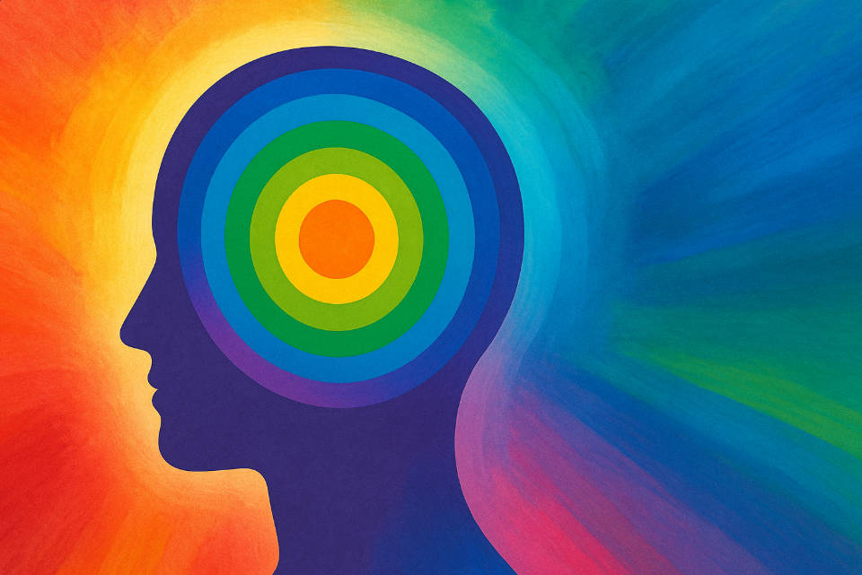
Color psychology is the study of how colors affect human emotions, behaviors, and decision-making processes.
Have you ever wondered why fast-food restaurants use red and yellow in their branding, or why hospitals often feature calming blues and greens? The answer lies in color psychology – the study of how colors affect human emotions, behaviors, and decision-making processes.
Color psychology is not just theoretical; it's a practical tool used by marketers, designers, therapists, and artists to influence mood, create atmosphere, and communicate messages without words. Understanding these color associations can help you make more informed decisions in everything from home decoration to brand development.
The Science Behind Color Psychology
Colors affect us on both physiological and psychological levels. When we see a color, our brain processes the visual information and triggers emotional and physical responses. This happens because:
- Evolutionary associations: Red signals danger (blood, fire), while green represents safety (vegetation, water)
- Cultural conditioning: We learn color meanings through social experiences and cultural contexts
- Personal experiences: Individual memories and associations shape our color preferences
- Physiological responses: Colors can actually affect heart rate, blood pressure, and brain activity
Red: The Color of Passion and Power
Emotional Associations
Passion • Energy • Excitement • Urgency • Love • Anger • Power • Confidence
Red is perhaps the most emotionally intense color in the spectrum. It's the color of fire, blood, and roses – representing both love and danger. In color psychology, red is known to:
- Increase heart rate and blood pressure – making it perfect for creating urgency
- Stimulate appetite – which is why many restaurants use red in their decor
- Grab attention – red is often used for warning signs and call-to-action buttons
- Convey confidence and power – think of red carpets and power ties
Brand Examples: Coca-Cola uses red to create excitement and energy, while Netflix employs red to grab attention and create urgency around their content. Ferrari's red represents speed, passion, and luxury.
Green: The Color of Nature and Growth
Emotional Associations
Nature • Growth • Harmony • Balance • Freshness • Safety • Money • Health
Green is the color of nature, representing life, renewal, and energy. It's the most restful color for the human eye and has strong associations with:
- Tranquility and balance – green is often used in spaces designed for relaxation
- Health and wellness – many healthcare and organic brands use green
- Financial prosperity – the color of money in many cultures
- Environmental consciousness – green brands often emphasize sustainability
Brand Examples: Starbucks uses green to convey freshness and environmental responsibility, while Whole Foods employs green to emphasize natural, healthy products. John Deere's green represents growth and agriculture.
Blue: The Color of Trust and Tranquility
Emotional Associations
Trust • Reliability • Calm • Stability • Professionalism • Loyalty • Wisdom • Peace
Blue is the world's most popular color and for good reason. Associated with the sky and ocean, blue represents vastness, stability, and trust. Blue psychology shows it can:
- Lower heart rate and blood pressure – creating a calming effect
- Enhance focus and mental clarity – often used in office environments
- Build trust and credibility – why many financial institutions use blue
- Suppress appetite – blue is rarely found in natural foods
Brand Examples: Facebook, Twitter, and LinkedIn all use blue to convey trust and reliability. IBM's blue represents professionalism and technological expertise.
Cyan: The Color of Innovation and Clarity
Emotional Associations
Innovation • Clarity • Freshness • Technology • Cleanliness • Communication • Creativity
Cyan, a blue-green color, combines the calming properties of blue with the refreshing qualities of green. In modern color psychology, cyan represents:
- Technological innovation – often used by tech companies and startups
- Clear communication – cyan enhances readability and comprehension
- Freshness and cleanliness – popular in healthcare and hygiene products
- Creative thinking – stimulates mental clarity and inspiration
Brand Examples: Skype uses cyan to represent clear communication, while many tech startups employ cyan to convey innovation and modernity. You can explore cyan further in our detailed guide on what is cyan color.
Other Important Colors in Psychology
Yellow: Optimism and Energy
Yellow represents happiness, optimism, and mental stimulation. It's attention-grabbing and energizing but can cause anxiety in large amounts. McDonald's uses yellow to create a cheerful, welcoming atmosphere.
Purple: Luxury and Creativity
Purple combines the energy of red with the stability of blue, representing luxury, creativity, and spirituality. Brands like Cadbury and Yahoo use purple to convey premium quality and imagination.
Orange: Enthusiasm and Warmth
Orange is energetic and warm, representing enthusiasm, creativity, and affordability. Home Depot and Fanta use orange to create friendly, approachable brand personalities.
Black: Sophistication and Power
Black represents elegance, sophistication, and authority. Luxury brands like Chanel and Apple use black to convey premium quality and timeless style.
White: Purity and Simplicity
White symbolizes purity, cleanliness, and simplicity. It's often used in healthcare, technology, and minimalist design to create a sense of space and clarity.
Color Psychology in Different Contexts
Branding and Marketing
Companies invest heavily in color psychology research to choose brand colors that align with their values and appeal to their target audience. The right color can:
- Increase brand recognition by up to 80%
- Influence purchasing decisions
- Communicate brand personality without words
- Create emotional connections with customers
Interior Design and Architecture
Color psychology plays a crucial role in creating functional and comfortable spaces:
- Bedrooms: Soft blues and greens promote relaxation and sleep
- Kitchens: Warm colors like red and orange stimulate appetite and conversation
- Offices: Blue enhances productivity, while green reduces eye strain
- Hospitals: Calming blues and greens help reduce patient anxiety
Art and Creative Expression
Artists have long understood the emotional power of color. From Van Gogh's expressive yellows to Picasso's blue period, color choices can convey mood, emotion, and meaning in powerful ways.
Cultural Variations in Color Psychology
While some color associations are universal, many vary significantly across cultures:
- Red: Lucky in China, but associated with danger in Western cultures
- White: Purity in Western cultures, but mourning in some Asian cultures
- Green: Nature in most cultures, but can represent inexperience in English
- Blue: Generally positive worldwide, but can represent sadness in some contexts
When designing for global audiences, it's essential to consider these cultural differences to avoid unintended negative associations.
Practical Applications of Color Psychology
For Designers and Marketers
- Use red for call-to-action buttons to create urgency
- Employ blue for trust-building elements like testimonials
- Choose green for eco-friendly or health-related products
- Consider your target audience's cultural background
For Personal Spaces
- Paint your bedroom in calming blues or greens for better sleep
- Use energizing colors like orange in workout spaces
- Choose neutral colors for spaces where you need to focus
- Add colorful accents to influence your mood throughout the day
For Digital Design
- Use high contrast colors for accessibility
- Choose colors that work well on different devices and screens
- Consider the emotional journey you want users to experience
- Test color combinations with your target audience
Tools for Working with Color Psychology
Understanding color psychology is just the beginning. To effectively apply these principles, you need the right tools:
- RGB Color Picker: Perfect for digital design projects
- Color Palette Generator: Create harmonious color schemes
- Color Mixing Chart: Understand how colors interact
- HEX to RGB Converter: Convert between color formats
Conclusion: The Power of Color in Human Experience
Color psychology reveals the profound impact that colors have on our emotions, behaviors, and decisions. Whether you're designing a brand, decorating a space, or simply choosing what to wear, understanding these color associations can help you communicate more effectively and create the desired emotional response.
Remember that while color psychology provides valuable guidelines, individual responses to color can vary based on personal experiences, cultural background, and context. The key is to understand the general principles while remaining sensitive to your specific audience and situation.
As you continue exploring the fascinating world of color, consider experimenting with our color mixing tools to see how different combinations can create new emotional experiences and visual effects.
Key Takeaways
- • Colors have measurable psychological and physiological effects on humans
- • Red energizes and creates urgency, while blue builds trust and calm
- • Green represents nature and growth, cyan symbolizes innovation and clarity
- • Cultural context significantly influences color perception and meaning
- • Effective color use can enhance branding, design, and personal well-being