Understanding Color Theory: A Comprehensive Guide
Color theory is the scientific and artistic study of how colors interact, influence perception, and affect human emotions and behavior. This comprehensive guide explores the fundamental principles that govern color relationships and their practical applications in design, art, and digital media.
Table of Contents
What is Color Theory?
Color theory encompasses the science and art of using color. It explains how humans perceive color, how colors mix, match or clash, the messages colors communicate, and the methods used to replicate color. Color theory was first formally described by Sir Isaac Newton in 1666 when he discovered that white light could be separated into the visible spectrum through a prism.
At its core, color theory provides a logical structure for color relationships. It helps us understand:
- How the human eye perceives different wavelengths of light as colors
- The psychological and emotional impact of different colors
- How colors interact when placed together
- Methods for creating harmonious color combinations
- Cultural and contextual meanings of colors
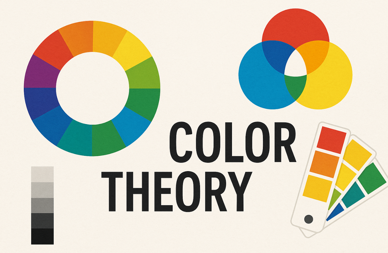
Color Wheel Basics
The color wheel is a circular diagram that organizes colors based on their relationships. It serves as the foundation for understanding color combinations and harmonies in both traditional art and digital design.
Primary Colors
Red, Blue, Yellow - Cannot be created by mixing other colors
Secondary Colors
Green, Orange, Purple - Created by mixing two primary colors
Tertiary Colors
Red-Orange, Yellow-Green, etc. - Mix of primary and secondary
RGB vs RYB: Understanding Color Models
Two primary color models dominate color theory: RGB (Red, Green, Blue) and RYB (Red, Yellow, Blue). Understanding their differences is crucial for digital designers and traditional artists.
RGB Color Model
- • Additive color model - colors add up to white
- • Used in digital displays, screens, and web design
- • Primary colors: Red, Green, Blue
- • Best for: Digital art, web design, photography
- • Color range: 16.7 million colors possible
RYB Color Model
- • Subtractive color model - colors subtract to black
- • Used in traditional painting and art education
- • Primary colors: Red, Yellow, Blue
- • Best for: Traditional painting, color mixing theory
- • More intuitive for beginners learning color
Pro Tip: Use RGB for digital projects and RYB concepts for understanding traditional color relationships. Modern digital tools often combine both approaches for optimal results.
Color Scheme Types & Applications
Color schemes are strategic combinations of colors that create specific visual effects and emotional responses. Each scheme serves different purposes and contexts.
Complementary Colors
Best for: Call-to-action buttons, highlighting important elements, creating visual impact
Example: Facebook's blue and orange notification system
When to Use:
- • High contrast needed
- • Drawing attention to specific elements
- • Creating energetic, vibrant designs
- • Sports team branding
Analogous Colors
Best for: Creating calm, harmonious designs, nature themes, gradients
Example: Spotify's green gradient interface
When to Use:
- • Peaceful, serene atmosphere
- • Background color schemes
- • Nature and wellness brands
- • Subtle color transitions
Triadic Colors
Best for: Playful designs, children's products, creative industries
Example: Google's primary brand colors
When to Use:
- • Balanced yet vibrant designs
- • Creative and artistic projects
- • Children's products and education
- • Retro and vintage themes
Monochromatic Colors
Best for: Professional websites, minimalist designs, creating depth
Example: LinkedIn's blue monochromatic scheme
When to Use:
- • Professional, sophisticated look
- • Minimalist and clean designs
- • Creating visual hierarchy
- • Corporate and business applications
Color Psychology & User Behavior Impact
Color psychology studies how colors affect human behavior, emotions, and decision-making. Research shows that colors can influence click-through rates, bounce rates, and brand perception by up to 85%.
Impact on Digital Metrics
Average increase in click-through rates with optimized color choices
Reduction in bounce rates with proper color contrast
Of brand recognition attributed to color
Color Emotional Associations
Red
Urgency, passion, energy. Increases heart rate and creates urgency.
Blue
Trust, security, professionalism. Most preferred color globally.
Green
Growth, health, money. Associated with positive actions.
Yellow
Optimism, creativity, attention. Can cause eye strain in large amounts.
Purple
Luxury, creativity, mystery. Associated with premium brands.
Orange
Enthusiasm, creativity, warmth. Encourages impulsive buying.
Pink
Femininity, romance, nurturing. Appeals to specific demographics.
Gray
Neutrality, sophistication, balance. Professional and timeless.
Industry Color Recommendations
Different industries benefit from specific color palettes that align with their brand values and user expectations. Here are evidence-based recommendations:
Healthcare & Medical
Why these colors: Blue conveys trust and reliability, green represents health and healing, white suggests cleanliness and sterility.
Examples: Mayo Clinic (blue), Cleveland Clinic (green), most hospital interiors (white/blue)
Finance & Banking
Why these colors: Dark blue suggests stability and trust, green represents money and growth, gray conveys professionalism.
Examples: Chase Bank (blue), TD Bank (green), Wells Fargo (red/yellow for energy)
Technology & Software
Why these colors: Blue suggests reliability and innovation, purple conveys creativity and forward-thinking, orange represents energy and enthusiasm.
Examples: Facebook (blue), Twitch (purple), Firefox (orange)
Food & Restaurant
Why these colors: Red stimulates appetite and creates urgency, orange is energetic and friendly, yellow is associated with happiness and fast service.
Examples: McDonald's (red/yellow), Burger King (red/yellow), Dunkin' (orange/pink)
Practical Case Studies & Research Data
Case Study 1: E-commerce Button Color Testing
Company: HubSpot (A/B Testing Study)
Test: Red vs Green call-to-action buttons
21% higher click-through rate
Baseline performance
Key Insight: Red's urgency and attention-grabbing properties outperformed green's "go" association in this context.
Case Study 2: Brand Color Recognition Study
Research: University of Loyola Marketing Study (2021)
Finding: Color increases brand recognition by up to 80%
Time to recognize colored logos
Time to recognize black & white logos
Purchase decisions influenced by color
User Color Preference Testing Results
Survey: 2025 Global Color Preference Study (n=10,000)
Apply Color Theory with Our Tools
Put your color theory knowledge into practice with our professional color tools: