Advanced Color Mixing Techniques for Artists and Designers
Master Professional Methods for Creating Sophisticated Color Combinations
Table of Contents
Professional color mixing setup showing advanced techniques
Color Temperature Mixing
Understanding color temperature is crucial for creating sophisticated color relationships. Every color has a warm or cool bias, and recognizing this allows you to create more harmonious mixtures.

Comparison of warm and cool versions of primary colors
Warm vs Cool Primary Colors
- Warm Reds: Cadmium Red, Vermillion (lean toward orange)
- Cool Reds: Alizarin Crimson, Quinacridone Rose (lean toward purple)
- Warm Blues: Ultramarine Blue, Prussian Blue (lean toward purple)
- Cool Blues: Cerulean Blue, Phthalo Blue (lean toward green)
- Warm Yellows: Cadmium Yellow, Yellow Ochre (lean toward orange)
- Cool Yellows: Lemon Yellow, Cadmium Yellow Light (lean toward green)
The secret to creating vibrant secondary colors is using primary colors with compatible temperature biases. For instance, mixing a warm red (cadmium red) with a warm yellow (cadmium yellow) creates a much more vibrant orange than mixing cool versions of these colors.
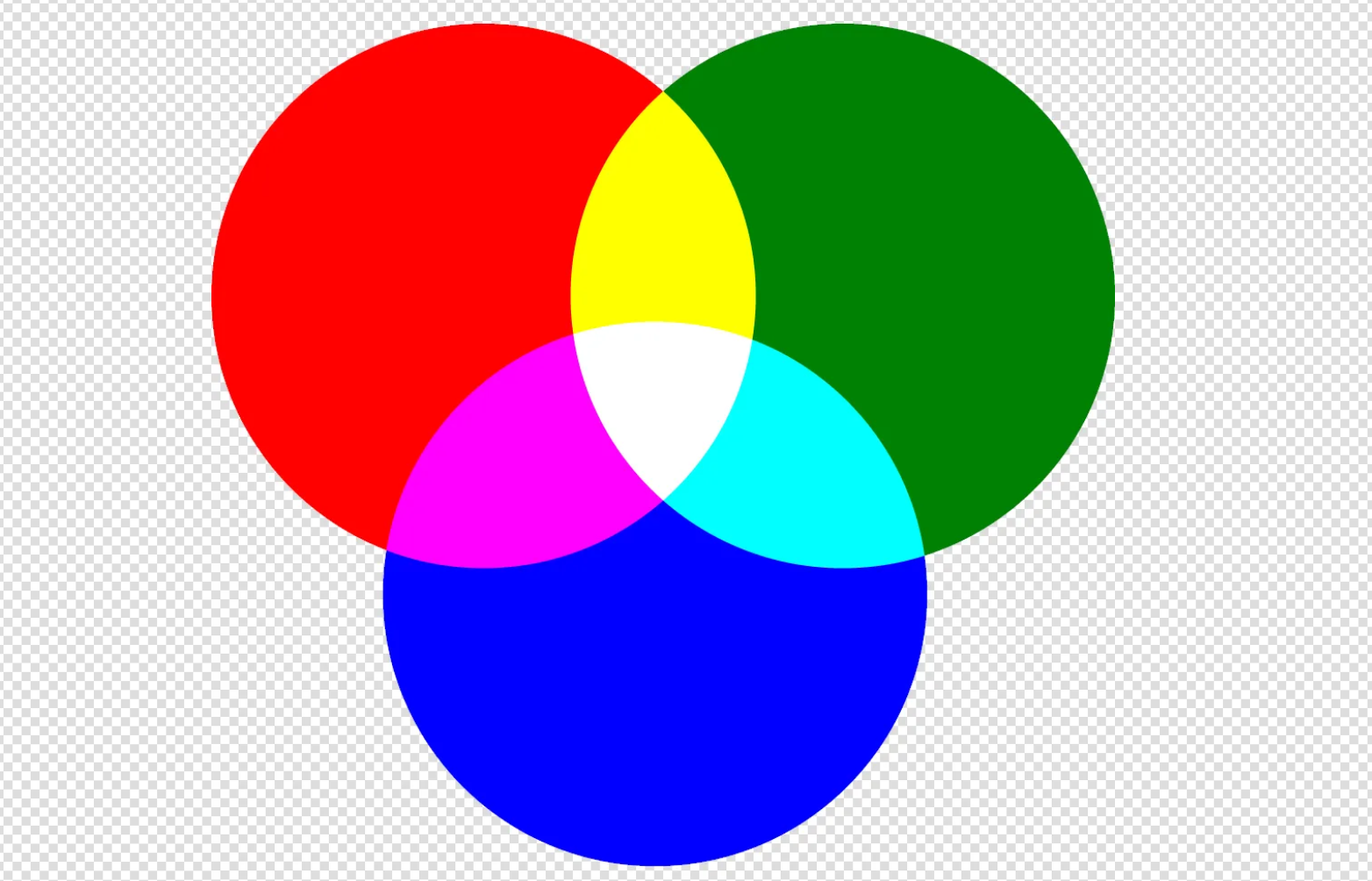
Optical Color Mixing
Optical mixing occurs when colors are placed next to each other and blend in the viewer's eye rather than being physically mixed on the palette. This technique, pioneered by Impressionist and Post-Impressionist painters, creates more vibrant and luminous colors.

Optical mixing techniques: pointillism, broken touch, and scumbling examples
Techniques for Optical Mixing:
- Pointillism: Small dots of pure color placed next to each other
- Broken Touch: Short, visible brushstrokes of different colors
- Scumbling: Dry brush technique over existing colors
- Cross-hatching: Overlapping lines of different colors
When using optical mixing, remember that warm colors advance while cool colors recede. This principle can be used to create depth and dimension in your work without relying solely on value changes.
Glazing and Layering Techniques
Glazing involves applying transparent or semi-transparent layers of color over dry underlayers. This technique allows for incredibly subtle color variations and can create colors that are impossible to achieve through direct mixing.
Glazing demonstration showing the build-up of transparent color layers
Glazing Best Practices:
- Always work with completely dry underlayers
- Use a glazing medium to increase transparency
- Apply thin, even coats to avoid muddiness
- Build up colors gradually through multiple layers
- Use complementary glazes to create neutral tones
For digital artists, glazing can be simulated using layer blend modes such as Multiply, Overlay, and Color Burn. These modes mathematically combine colors in ways that mimic traditional glazing effects.
Broken Color Techniques
Broken color refers to the technique of applying colors in small, distinct touches rather than smooth, blended areas. This approach maintains color purity while creating complex visual mixtures.
Applications of Broken Color:
- Skin Tones: Use separate touches of warm and cool colors
- Foliage: Combine multiple greens with touches of complementary colors
- Sky Painting: Layer blues, purples, and warm tones without complete blending
- Water Reflection: Use broken horizontal strokes to suggest movement
The key to successful broken color technique is maintaining consistent color temperature relationships while varying the hue and intensity of your color choices.
Professional Color Graying Methods
Professional artists rarely use black to darken colors or create gray tones. Instead, they employ sophisticated graying techniques that maintain color harmony and create more natural-looking results.
Different approaches to graying colors: complementary, triadic, and earth tone methods
Advanced Graying Techniques:
- Complementary Graying: Add small amounts of complementary colors
- Triadic Graying: Mix three colors equally spaced on the color wheel
- Earth Tone Graying: Use raw umber or burnt sienna instead of black
- Atmospheric Graying: Add touches of violet for distance effects
Graying Formula Examples:
- Red Grays: Red + small amount of Viridian Green
- Blue Grays: Blue + small amount of Burnt Sienna
- Yellow Grays: Yellow + small amount of Dioxazine Purple
- Warm Grays: Burnt Umber + Ultramarine Blue + White
- Cool Grays: Payne's Gray + small amount of Blue
Digital Color Mixing Strategies
Digital color mixing offers unique advantages and challenges compared to traditional media. Understanding how different color modes and blend modes work is essential for digital artists.
Digital art software interface demonstrating blend modes and color mixing tools
Digital Mixing Techniques:
- Color Picker Mixing: Use the color picker to sample and blend colors directly
- Layer Blending: Utilize different blend modes for complex color interactions
- Gradient Mapping: Apply color gradients to grayscale images
- Adjustment Layers: Non-destructive color modifications
Useful Blend Modes for Color Mixing:
- Multiply: Darkens colors, ideal for shadows
- Screen: Lightens colors, perfect for highlights
- Overlay: Enhances contrast while preserving details
- Soft Light: Subtle color modifications
- Color: Changes hue while preserving luminosity
Advanced Palette Construction
Building an effective color palette requires strategic thinking about color relationships, mixing potential, and the specific needs of your project.
Professional palette setups for portrait, landscape, and alla prima painting
Professional Palette Strategies:
- Limited Palette: Use only 3-5 colors plus white for maximum harmony
- Split-Complementary: Use three colors forming a Y-shape on the color wheel
- Analogous Plus: Adjacent colors with one strategic accent color
- Temperature-Based: Separate warm and cool versions of each primary
Example Professional Palettes:
- Portrait Palette: Cadmium Red Light, Raw Umber, Yellow Ochre, Ultramarine Blue, Titanium White
- Landscape Palette: Phthalo Blue, Burnt Sienna, Cadmium Yellow, Alizarin Crimson, Titanium White
- Alla Prima Palette: Cadmium Red, Cadmium Yellow, Ultramarine Blue, Burnt Umber, Titanium White
Common Mixing Mistakes to Avoid
Even experienced artists can fall into common mixing traps. Recognizing and avoiding these mistakes will elevate your color work significantly.
Common color mixing mistakes (left) vs. corrected techniques (right)
Mistakes to Avoid:
- Overmixing: Mixing colors until they become muddy and lifeless
- Using Too Many Colors: Creating chaos instead of harmony
- Ignoring Color Temperature: Mixing incompatible temperature biases
- Overusing Black: Creating dead, lifeless darks
- Neglecting Value: Focusing only on hue while ignoring lightness/darkness
- Poor Palette Organization: Mixing colors in random locations
Solutions and Best Practices:
- Mix colors with confident, deliberate strokes
- Plan your color scheme before you start mixing
- Keep warm and cool colors separated on your palette
- Create color swatches to test mixtures before applying
- Study master paintings to understand successful color relationships
Practice Your Advanced Mixing Skills
Master these advanced techniques by experimenting with our Color Mixing Tool. Practice temperature mixing, create sophisticated grays, and develop your understanding of color relationships through hands-on experimentation.